Bootstrap color selector as an Angular Directive
For a SharePoint Hosted App I needed a simple & user friendly Angular & Bootstrap based color selector directive. This blog post describes the final solution and shows how easy it is to move JavaScript based features to an Angular directive. Additionally there is a link to a plunkr so you can check the code online.
I developed the Angular directive based on an existing Bootstrap & jQuery based color selector. I made some minor improvements concerning usability.
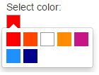
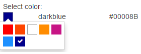
The solution described in pictures:
| Inital state: |  |
| Select a color, for instance dark blue: |  |
| Color selected: | |
| Reselecting a color the selected color is marked with a check icon: |  |
The Angular directive uses its own scope to guarantee reusability.
If you know how to set up an Angular directive, the solution is quite easy:
- Copy the JavaScript code of the Color Selector (see link below @flaute) to the link function of the directive.
- Execute "$('.colorselector').colorselector()" in the link function to activate the feature and create the Bootstrap based selection list.
- Create a function to update the scope variables holding the color values.
- If a color has been selected, call the function (see 3.) to update the scope.
You can check the solution online at plunkr.
My solution is based on the following code:
Updates to the code from @flaute:
- Added a 1px wide black border for color "white" (#FFFFFF). Makes the white square easier to select for the user.
- If "white" is selected, the coloured square box gets a 1px wide black border. Otherwise you would not see the selected color (white squared icon on white background).
- Using FontAwesome instead of Glyphicons.
